


We love graphs! But there are so many graphs and graphing packages out there, we thought we would put together a little tutorial on how to look at our maps, and what each area represents. We hope you will find it useful!
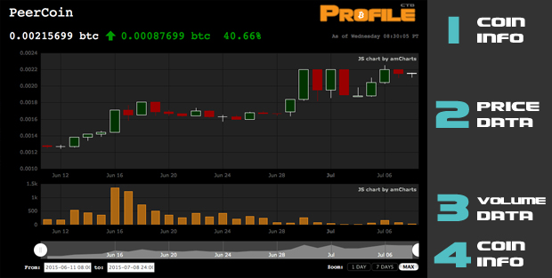
Section 1: Coin Information
Here you will find the name of the coin, it’s current price, and it’s price change over the last 24 hours. Prices that go down are denoted in red, prices that go up, in green.
Section 2: Price Data
We like to use candlestick charts to get a better read on what’s going on. The y-axis represents the coin’s price in Bitcoin. When you mouseover the candlestick body, you will see a rollover that tells you the open, Close low and High values for that time period.
Stockcharts.com has an excellent read on what candlestick charts are all about:
In order to create a candlestick chart, you must have a data set that contains open, high, low and close values for each time period you want to display. The hollow or filled portion of the candlestick is called “the body” (also referred to as “the real body”). The long thin lines above and below the body represent the high/low range and are called “shadows” (also referred to as “wicks” and “tails”). The high is marked by the top of the upper shadow and the low by the bottom of the lower shadow. If the stock closes higher than its opening price, a hollow candlestick is drawn with the bottom of the body representing the opening price and the top of the body representing the closing price. If the stock closes lower than its opening price, a filled candlestick is drawn with the top of the body representing the opening price and the bottom of the body representing the closing price.
We don’t use hollow bodies, instead we use green bodies to denote when a coin has closed higher than it opened, and a red body when the close is lower than the open.
Section 3: Volume Data
The y-axis represents the coin’s volume of trading in Bitcoin. By using the same date information on the x-axis as the price data, the volume readings correspond to the candlestick markings for each time frame in the graph.
Section 4: Time Line
This is where you go to customize the information that you are looking for. The entire timeline rectangle is a graph if you look closely – and represents a line drawing of the closing prices over that time. You can grab and drag the circles at either end to “shrink” or “grow” the timeframe you are looking at. You can also manually enter the date information in the text boxes provided in the bottom left. Lastly, you can use the buttons in the bottom right to choose whatever periods of data are available there. Depending on the amount of information we have tracked for that coin, this could be 1 Day, 7 Days, 1 month, YTD, 1 year or Max.


